Color can be hard, and it seems that a lot of people just avoid it all together. Or they choose just one color in a few places in the room and end up with a space that is kind of one note or flat. Do you know where to start with color? You don’t have to come up with your own color scheme from your imagination, most professionals don’t even do that! Today I’m going to show you how to deconstruct a color scheme that you love and use it to decorate a room.
How to Deconstruct a Color Scheme
Start with Inspiration
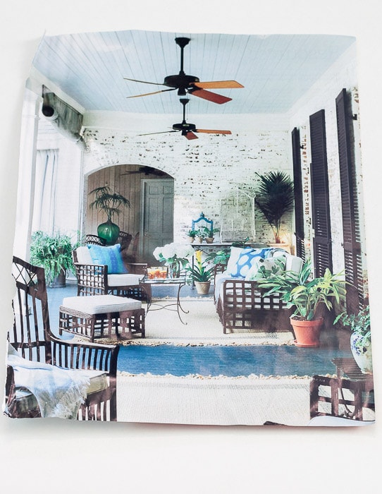
Inspiration can literally come from anything. I’m sure you’ve probably heard about starting with a colorful rug or piece of art and pulling colors from those items. You could also be inspired by a beautiful coffee mug, scarf, or product label. But if you’re not used to looking for inspiration in these unique places, let me give you an even easier way. Magazines. Chances are you’ve come across a home magazine (or an image on Pinterest) and you just love the colors the designer used. This photograph is what we will work from to build a color scheme for your space!
Get Out Your Paints
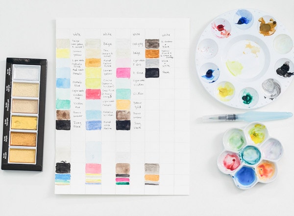
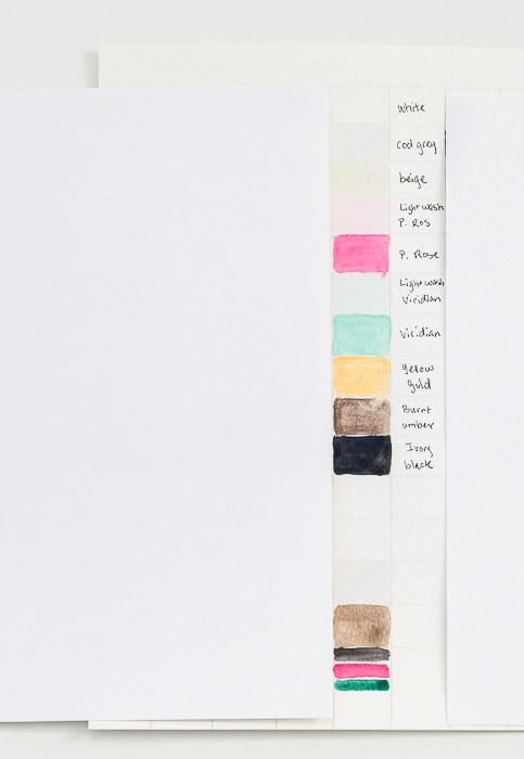
Get out some watercolor paints, paper and a brush and start playing with mixing colors. You don’t need expensive paints for this, but something a little more than dollar store paints would be helpful. I’m using a student set and this metallic paint, and want to try these and these.
***Note: this post contains affiliate links. To read more about my disclosure policy, click here.***
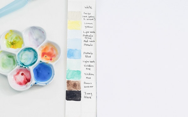
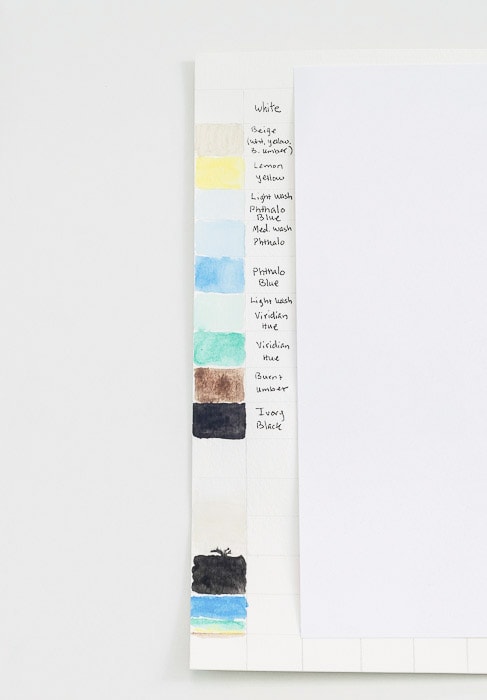
Start with the main colors in your reference, and try to mix colors that match or are at least close. Notice EVERY color represented on the page. Usually, it’s the whole color story that we are reacting to, not just the focal color. For example, in this first photo, white, black, and blue are the strongest colors, but it wouldn’t be the same space without the touches of green, brown, and yellow.
A bonus of using watercolor paints, you can play with the values of colors. You can see in my example a light wash (more water in the paint) of phthalamo blue, a medium wash (a little less water), and a more true blue (not much water). Do you see the light wash on the ceiling, the medium wash on the pillows, and true color on the floor?
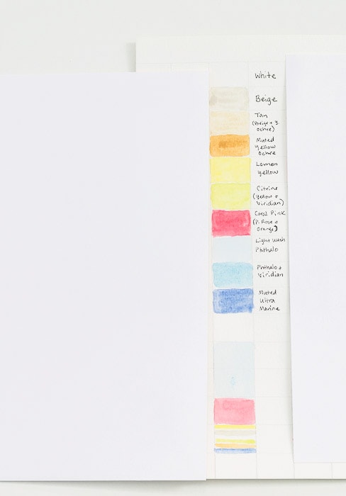
Your reference doesn’t have to be an actual room. The cover of this Coastal Living issue is just gorgeous, and the color scheme could work in a number of rooms. Imagine the color of the ocean as the paint on the walls, white and wicker furniture, coral and blue pillows, and touches of lemon and citrine in small decor pieces.
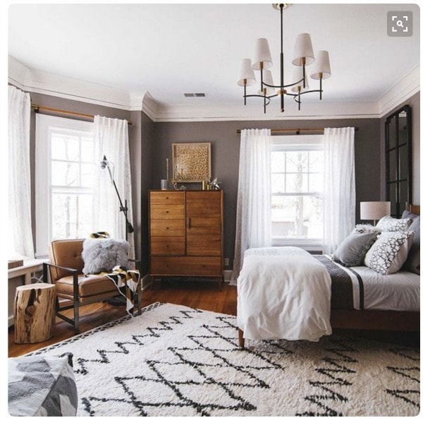
Here are two more reference photos I did, because this process is so fun it’s hard to stop.
Photo Source: Pinterest (original source unknown)
Photo Source: West Elm via Pinterest
Proportion of Color
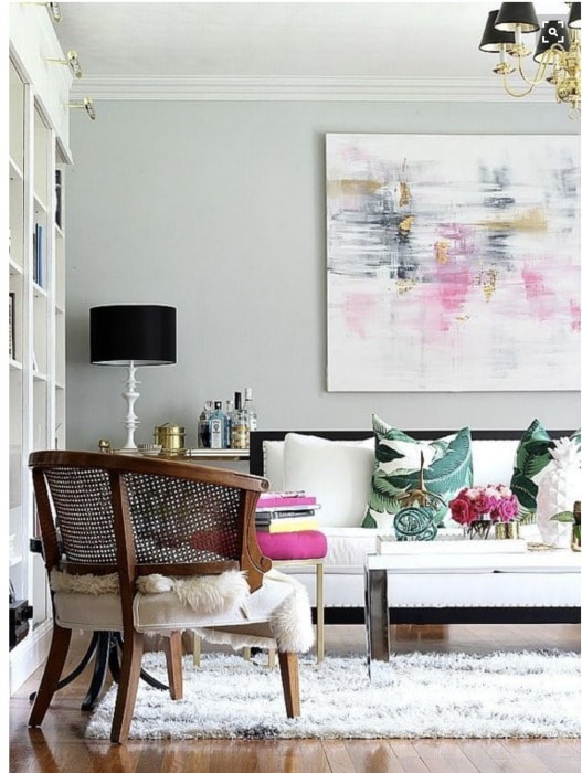
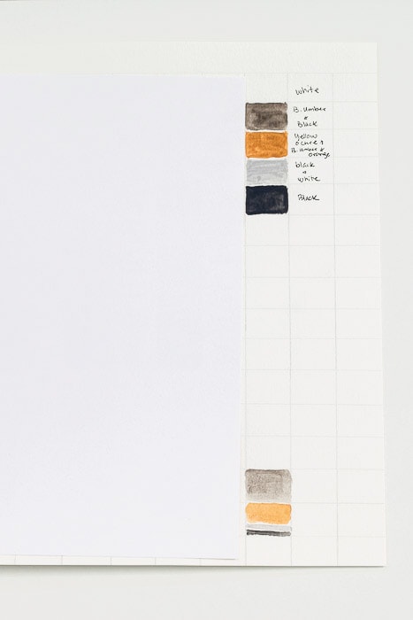
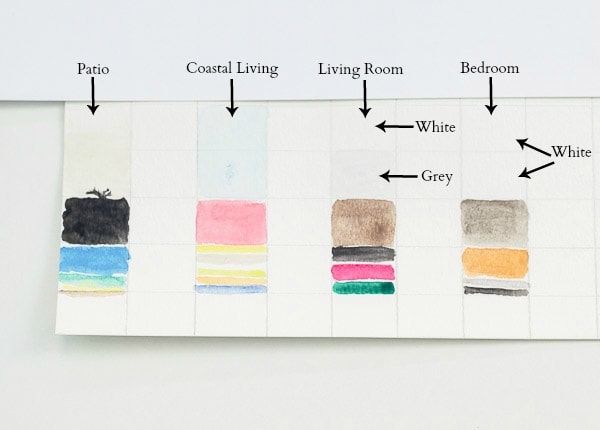
Now you have the colors identified, let’s also talk about the proportion of the colors in these rooms. Notice in the paintings above that underneath the color swatches for each room the colors are repeated again in a more condensed version. Those squares roughly represent the proportions of each color.
White plays a big role in the living room, so it has it’s own square. Grey is also a large proportion, since the walls are grey, so it also has it’s own square. There is a lot of brown too, in the floor and the chair, so it has a square. And then small strips of black, pink and green represent the light touch with those colors.
I did the same exercise with each of the color schemes, so go back and take a look at the photos if you need to. In each color scheme, there is a predominant color, a secondary color, and then supporting colors. The proportion of color helps to keep the room from looking too colorful to the point of crazy, even in a room with few neutrals (Coastal Living).
Speaking of neutrals, the neutral bedroom still benefits from this exercise. Note the proportion of colors. Even with a lot fewer colors to work with, the proportions (dominant, secondary, supporting) still hold true.
Go Shopping
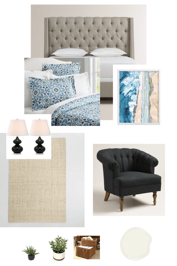
After deconstructing the color scheme of your reference photo, it’s time to go shopping! This is where your personality, your home, your family and your budget come into play. You get to make the space yours by the specific choices that you make, using the deconstructed color scheme as your guide. I’ll share an example with you of how I would take the blue, white and black color scheme and translate it into a bedroom.
Tufted Bed | Duvet Cover | Art | Lamps | Rug | Chair | Faux Aloe Plant | Faux Plant | Basket | White Paint (Dove White)
I hope that this post will inspire you to go play with color, I would love to see what you come up with! Tag me on social media @happymeetshome.
If you’d like to get more decorating inspiration, sign up for the email newsletter in the box below! And check out these posts:
