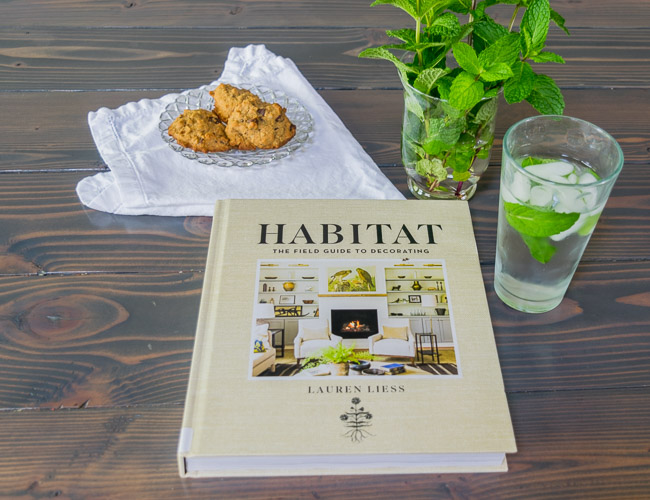
Today I’m sharing a new edition to the What I’m Reading series, Habitat: The Field Guide to Decorating by Lauren Liess. This is a newer book that I had heard quite a bit of buzz about in blogger/decorator circles (you know, by reading blogs, not that I’m in any of those circles), and now I know why! It took weeks of waiting for my turn with it from the library, but it was worth the wait.
Here’s what I found on the copyright page:
Every work of man which has beauty in it must have some meaning also; that the presence of any beauty in a piece of handicraft implies that the mind of the man who made it was more or less excited at the time, was lifted somewhat above the commonplace; that he had something to communicate to his fellows which they did not know or feel before, and which they would never have known or felt if he had not been there to force them to it.
-William Morris 1841
I knew immediately that this book was going to be good.
Habitat is pretty dense, but in a good way. When Lauren included “Field Guide” in her title, she wasn’t just being cute. I’ve read quite a few design books now, and this one goes on the short list of really good “how to” decorating books. I really like how Lauren explains some of her thought process, her decision making, and the details of creating a beautiful space. Decorating a beautiful room doesn’t just “happen”, or just “come together” the way some books allude to. If you want some behind the scenes for how a decorator works, check this book out!
The chapters are broken down into three parts: The Fundamental Elements of Design, The Intangible Elements of Design, and Room-by-Room Guide.
The Fundamental Elements of Design would be what I call the nuts and bolts of design. Want to see a completed floor plan? Learn all the different elements that are included in that plan? Does it surprise you that Lauren creates a plan for each wall of a space? This section also goes into detail about how the architecture of your home affects the design choices you should make, and how to compensate if you have boring architecture. She talks about choosing the basics, like hardware and lighting, and the items that make the home personal to you, like window treatments and art. Here’s something Lauren shared in the furniture section that addresses a questions people frequently ask me:
“With wood, I often do a mix of different finishes with similar undertones, such as gray or orange, that blend well together. Not everything needs to match perfectly, but there should be a relationship between the different wood elements, and they should complement one another.” -Lauren Liess, Habitat
The next section is so fun, it’s all about the je ne sais quoi of decorating. Lauren talks about aesthetic and style, authenticity and juxtaposition, and comfort, luxury, and charm. She gives concrete examples of how she creates these things in the homes she decorates, with pictures of her own home as well as of clients homes. One of my favorite little nuggets was about furniture arrangement, something I’m sure we’ve all struggled with at different times.
“…it’s tempting to arrange the seating so that it’s the first thing you see upon entering the room, maybe set against a long wall, but it’s best to have seating face the focal point, not set up as the focal point.” -Lauren Liess, Habitat
Another really great tip was about the pattern to solid ratio in your space. A higher ratio of pattern will have more energy and feel busier, a lower ratio will feel more calm and have a slower pace. I love a lot of pattern in my decorating, but I’ve ran into the problem of my master bedroom feeling too busy because of a large pattern on the duvet of my bed. The bedroom is one place that I’ve learned to tone down the pattern use.
In the last section of Habitat, Lauren addresses each room of the home one at a time, sharing how she approaches the specific needs of that room. Bathrooms obviously have different uses than that of kitchens, and so you can use different forms of decorating based on the uses of the room. For example, Lauren suggests storing your fresh herbs and stalky lettuces out in the open on your kitchen counters in jars or pitchers of water. The produce will last longer, you are more likely to use it, and it adds some life to the room. I loved this idea and immediately went to my back yard and picked some fresh mint to have in the house for my water. This took me 30 seconds and I have been enjoying it for several days.
For the most part, I don’t love Lauren’s aesthetic, it’s not really what I would want in my home personally. There are several spaces in Habitat that were “oh wow” moments for me (whenever she uses blue), but overall she uses a little too much yellow, brown, and green for me to want to copy exactly what she’s done. But I can definitely learn from her principles, her approach, and her experience. I think that this will go on my “to purchase one day” list, because I can see myself wanting to refer to it in the future. It definitely is a great resource.
I’ll leave you with this quote from Habitat:
Your home’s atmosphere should represent a conscious choice. Think about how you want to feel when you’re in it, how you want others to feel, and how the house itself needs to “feel” so that people in it will respond accordingly. -Lauren Liess, Habitat
Want to learn more about Lauren or Habitat? Check out her book and her blog!
